Visualization Options in methyldeconv
methyldeconv provides several functions to visualize the results of cell-type deconvolution analyses. This vignette demonstrates how to use these visualization tools with example data.
Example Data
We’ll use example data from the minfi and
minfiData packages:
library(methyldeconv)
library(minfi)
library(minfiData)

# Example data
methyl_set <- minfiData::MsetEx
ratio_set <- minfi::ratioConvert(methyl_set)
beta_matrix <- minfi::getBeta(ratio_set)

# Run deconvolution
result <- methyldeconv::deconvolute(methyl_set = methyl_set, method = 'epidish')
result_multiple <- methyldeconv::deconvolute_combined(methyl_set = methyl_set,
                                                      methods = c('epidish','methylcc'),
                                                      array = '450k')
Barplot of Deconvolution Results
The results_barplot() function creates a barplot for
each sample, showing the estimated cell-type fractions:
methyldeconv::results_barplot(result)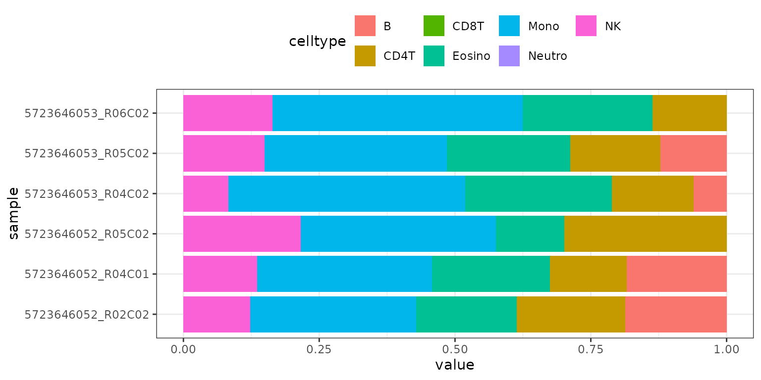
Boxplot of Deconvolution Results
The results_boxplot() function creates a boxplot for
each cell type, summarizing the distribution of estimated fractions
across samples:
methyldeconv::results_boxplot(result)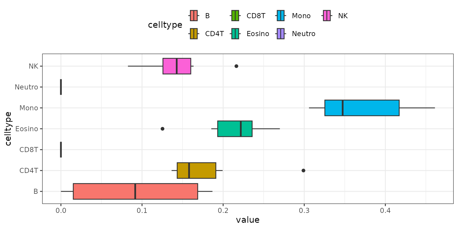
Aggregated Boxplot for Multiple Methods
If you run multiple methods using
deconvolute_combined(), you can visualize the aggregated
results with results_aggregated_boxplot():
methyldeconv::results_aggregated_boxplot(result_multiple)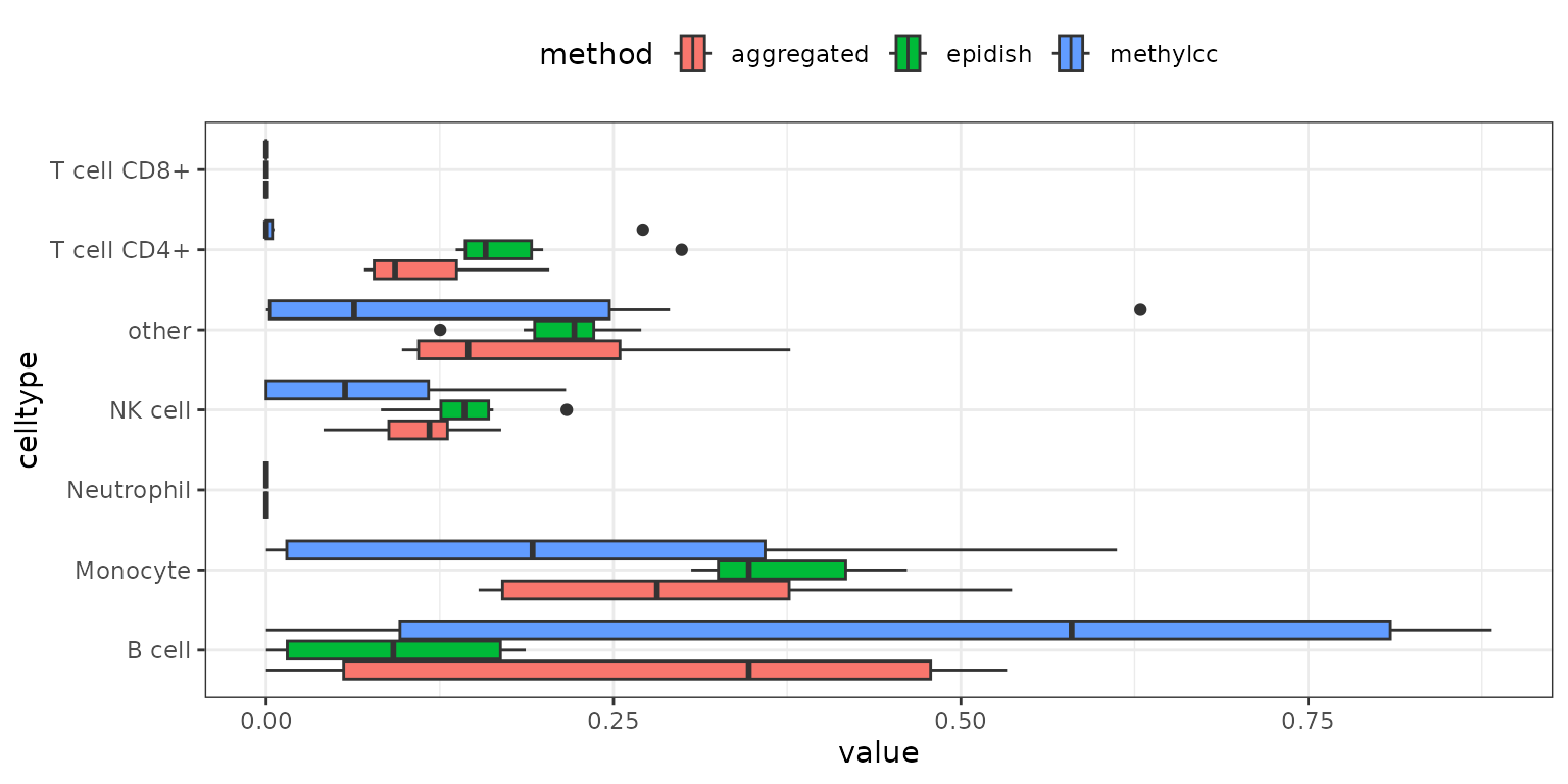
These visualization functions help you interpret and compare the
results of different deconvolution methods. For more customization
options, see the function documentation or explore the source code in
the R/visualization.R file.